

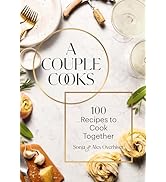
Pantone: The Twentieth Century in Color: (Coffee Table Books, Design Books, Best Books about Color)
Product ID: 50634711
Buy anything from 5,000+ international stores. One checkout price. No surprise fees. Join 2M+ shoppers on Desertcart.
Desertcart purchases this item on your behalf and handles shipping, customs, and support to Kyrgyzstan.
Pantone: The Twentieth Century in Color: (Coffee Table Books, Design Books, Best Books about Color) : Leatrice Eiseman, Keith Recker: desertcart.co.uk: Books Review: Pantone palettes make this the best way to achieve authentic period colour - This is a coffee-table sized decade by decade guide to the colours of the 20th century, with Pantone colour palette listings to enable you to reproduce them exactly right. In anything short of a truly exhaustive encyclopaedia, the choice of what to include is always going to be subjective, and the colour quality of the images is going to be dependent on the press. This is why the colour matching palettes are so important: if you have Pantone swatches, you can match the period colours. Despite the format, this is not a coffee table reminiscence of the 20th century. Rather, it is a guide for designers wishing to quickly achieve a period feel. There are thousands of 20th century review books out there, plus a wealth of material in libraries. However, because colour reproduction was relatively flakey up until the 1960s, and not truly compelling until the late 1990s, most of what is in print is a poor guide to what the colours were. On the other hand, there are still lots of people who remember the decades from the 1930s onwards, plus many others who have seen carefully preserved paintings and artefacts in museums. It's therefore easy to get the colours almost-right, but very hard to get them exactly right. It's easy to underestimate the amount of work that has gone into this book, and the difficulty of the task. Leatrice Eiseman is one of the few experts I really trust on colour, and her other Pantone books are essential resources on my book-shelf. Eiseman and Recker went back to original paintings, textiles and other artefacts to get the colours exactly right. In doing so, they have had to balance shifts in colours and perceptions and choose—as much as they could—the moment at which a colour was defining. Inevitably—as they admit—there will be discrepancies, but the result is still going to be far better—and far more convenient—than trying to match a Pantone colour to an sRGB image on the internet, captured in who-knows-what conditions and scanned with possibly little understanding of colour workflow. There are eight palettes for each decade—again, a difficult choice, as the authors admit. However, for most people working with colour, this is enough to achieve a period feel without having to go down to the V&A museum with a set of swatches. This is an enjoyable book in its own right, though nothing remarkable or hard to come by—except for the colour matching work, which puts it in the category of designers' 'must-haves'. Review: Lady Anna - I have just received in the post this week my 'new to me' Pantone the 20th Century in Colour book and I am ever so excited about it. I say new to me, because it was sold as used - but you wouldn't know, it looks spanking brand new!! I have just discovered desertcart - being a bit of an old school girl at heart - never really thought about buying on the internet... but now that I have received a few books recently and have been really happy with them I am becoming an online purchase junkie. I would definitely recommend this book to anyone wanting inspiration for colour palettes. Lady Anna


| Best Sellers Rank | 141,878 in Books ( See Top 100 in Books ) 105 in Graphic Design Colour Use 115 in Professional Interior Design 1,259 in Other Art Media & Techniques |
| Customer reviews | 4.8 4.8 out of 5 stars (654) |
| Dimensions | 24.13 x 2.54 x 28.89 cm |
| Edition | Illustrated |
| ISBN-10 | 0811877566 |
| ISBN-13 | 978-0811877565 |
| Item weight | 1.38 kg |
| Language | English |
| Print length | 204 pages |
| Publication date | 1 Oct. 2011 |
| Publisher | Chronicle Books |
| Reading age | 18 years and up |
M**R
Pantone palettes make this the best way to achieve authentic period colour
This is a coffee-table sized decade by decade guide to the colours of the 20th century, with Pantone colour palette listings to enable you to reproduce them exactly right. In anything short of a truly exhaustive encyclopaedia, the choice of what to include is always going to be subjective, and the colour quality of the images is going to be dependent on the press. This is why the colour matching palettes are so important: if you have Pantone swatches, you can match the period colours. Despite the format, this is not a coffee table reminiscence of the 20th century. Rather, it is a guide for designers wishing to quickly achieve a period feel. There are thousands of 20th century review books out there, plus a wealth of material in libraries. However, because colour reproduction was relatively flakey up until the 1960s, and not truly compelling until the late 1990s, most of what is in print is a poor guide to what the colours were. On the other hand, there are still lots of people who remember the decades from the 1930s onwards, plus many others who have seen carefully preserved paintings and artefacts in museums. It's therefore easy to get the colours almost-right, but very hard to get them exactly right. It's easy to underestimate the amount of work that has gone into this book, and the difficulty of the task. Leatrice Eiseman is one of the few experts I really trust on colour, and her other Pantone books are essential resources on my book-shelf. Eiseman and Recker went back to original paintings, textiles and other artefacts to get the colours exactly right. In doing so, they have had to balance shifts in colours and perceptions and choose—as much as they could—the moment at which a colour was defining. Inevitably—as they admit—there will be discrepancies, but the result is still going to be far better—and far more convenient—than trying to match a Pantone colour to an sRGB image on the internet, captured in who-knows-what conditions and scanned with possibly little understanding of colour workflow. There are eight palettes for each decade—again, a difficult choice, as the authors admit. However, for most people working with colour, this is enough to achieve a period feel without having to go down to the V&A museum with a set of swatches. This is an enjoyable book in its own right, though nothing remarkable or hard to come by—except for the colour matching work, which puts it in the category of designers' 'must-haves'.
A**A
Lady Anna
I have just received in the post this week my 'new to me' Pantone the 20th Century in Colour book and I am ever so excited about it. I say new to me, because it was sold as used - but you wouldn't know, it looks spanking brand new!! I have just discovered Amazon - being a bit of an old school girl at heart - never really thought about buying on the internet... but now that I have received a few books recently and have been really happy with them I am becoming an online purchase junkie. I would definitely recommend this book to anyone wanting inspiration for colour palettes. Lady Anna
V**S
Beautiful book!
Information and inspiration
S**U
A beautiful book!
I bought this for a friend, who shares my love of colour science. I was SO tempted to keep it for myself! It really is a beautiful book and should have pride of place on any coffee table.
C**.
Great
Interesting book
M**E
Excellent
Packed with information. Well & logically presented so quick & easy to use. Extremely good reference source for anyone involved in the decorative arts
N**R
A great system - should be used by the Post Office ...
A great system - should be used by the Post Office for Machin stamps as their colour names are bonkers.
M**A
Appreciated history/coffee table book
I didn’t have any specific expectations since I knew what I was getting.
A**A
The most interesting is the breakdown of the colors by the twentieth century decades and the different styles of each decade, with examples and color palettes. Great!
S**0
Good, solid, informational content. Well printed.
I**3
💯
H**Y
I was hesitant to buy a pantone product that was not from Pantone.com but WOW! It’s perfect, vibrant colors and images and overall great quality. Much cheaper than from the Pantone website too. Perfect for artists and color enthusiasts alike
C**R
Ótimo conteúdo
Trustpilot
4 days ago
3 weeks ago